You're editing a service or checkout page, and the shorter version sounds better, but it no longer says who qualifies or when a charge applies. To write accessible website copy, put the reader's task first, use clear structure and familiar language, and preserve every condition they need to make a decision. Good editing removes the effort of understanding, not the information that matters.
What Accessible Website Copy Has to Do
Accessible website copy helps readers find the main point, understand it, and take the next step. That has to hold whether they skim, use a screen reader, rely on translation, or read on a small phone.
Scanning is the default behavior on a new page; close reading is the exception. The opening cannot spend three sentences warming up while the condition that decides eligibility sits lower down. Put the task, price trigger, deadline, limitation, or warning where a scanner will meet it before committing.
If a line is short but stops saying who qualifies, it is not simpler. It is less usable.
Practical rule: A reader who skips the supporting explanation should still find the task and any condition that changes their decision.
Consider a hypothetical consultation page:
- Before: Welcome to our commitment to excellence in client care.
- After: Book a free 30-minute consultation in three steps.
The revision names the service and the next action. It works only if the consultation really is free, lasts that long, and follows that process. Clear wording cannot rescue an inaccurate promise.
Copy also depends on its surroundings. For context on how writing fits into a broader website review, the guide to website accessibility with PurpleCow Digital Marketing is a useful companion.
Treat the page as an information-finding task. The job is to remove avoidable effort while keeping the facts that change what a reader should do next.
How to Write Accessible Website Copy, Step by Step
Start with the page's job, not its existing sentences. Polishing a paragraph won't help if the reader's answer is buried beneath it.
Use this process when drafting or rebuilding a page.
Establish the task and outline
-
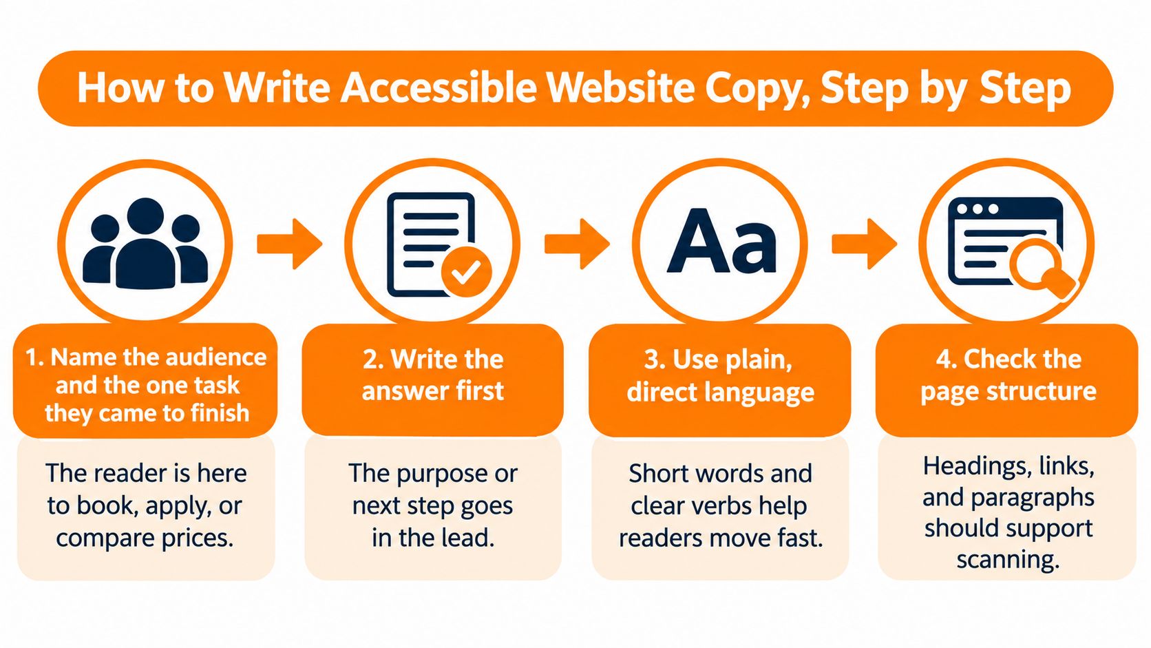
Name the audience and their task. Write a working sentence such as: This page helps tenants pay their rent. Booking, applying, and comparing prices require different information, so don't give them the same generic introduction.
-
Write the answer first. Put the purpose or next action in the opening sentences, alongside any condition that determines whether the reader can proceed. Background belongs later unless readers need it to act safely.
-
Build a descriptive heading outline. Use headings that name the content, such as Documents you need, rather than Your journey starts here. Keep heading levels in order, with one H1 per page and no H4 directly beneath an H2; WebAIM's 2025 analysis, as summarized by Be Accessible, found 39% of the top one million website homepages had improper heading structures.
Read just the headings before drafting the body. They should form a logical sequence without requiring you to remember what sits between them.
Draft the content and controls
-
Use direct sentences. Prefer familiar words, active voice, and a clear subject: We'll email your receipt is easier to follow than Receipt issuance will occur electronically. Keep each paragraph focused on a single idea rather than forcing an arbitrary sentence length.
-
Write labels separately from surrounding prose. Check links, buttons, and form labels outside their paragraphs. A control shouldn't need a nearby marketing sentence to explain its purpose.
-
Define and standardize terminology. Explain specialist terms at first use, then use the same term consistently. Switching between application, request, and submission can make readers wonder whether you mean different things.
-
Inspect functional text as its own editing pass. Review errors, instructions, image alternatives, legal conditions, and payment wording against the relevant source. These small pieces often carry consequences that ordinary copyediting misses.
-
Prepare a task-based reader check. Write a neutral prompt, such as Find how to change your payment method, rather than telling the reader which button to choose. Save the actual reader test for the final publish decision, after the complete page is ready.
Say a rent-payment page opens with a paragraph about flexible payment options. Move the actual due date and payment control into the opening lines, then replace a vague More link with See payment dates.
Keep payment support available, but don't put it between someone who's ready to pay and the payment action. The useful distinction is essential before acting versus helpful when needed, not short versus long.
Rewriting Headings, Links, Buttons, and Errors
Functional text often appears without its surrounding explanation. A screen reader user may move through links, while a skimmer may jump directly to a heading or button.
That makes specificity more useful than personality. Nottinghamshire County Council's accessible-content guidance recommends direct, everyday language, clear headings and lists, and action-focused wording.
Weak and accessible wording for common page elements
These hypothetical rewrites show what to change at the element level.
| Element | Weak version | Accessible version | Why it works |
|---|---|---|---|
| Link | Click here to read more | Read our 2026 pricing guide | Makes sense in a list of links read alone |
| Button | Submit | Send application | Names the action the reader takes |
| Heading | Our Solutions | Payment plans for small businesses | Tells the reader what the section contains |
| Error message | Invalid input | Enter the date as DD/MM/YYYY | Says what went wrong and how to fix it |
| Instruction | Your passport should be uploaded before continuing | Upload your passport | Leads with the action |
| Image alt text | image123.jpg | Advisor reviewing a loan contract at a desk | Describes relevant image content, not the file name |
The link example assumes that the destination really is a pricing guide with that year in its title. Labels must describe the actual destination, not a page you intend to publish later.
Buttons need the same discipline. Send application is appropriate when the action sends it; if the button opens a review screen, use Review application instead. On checkout pages, don't conceal a payment action behind Continue.
Name what happens after activation, not what your team calls the component.
Handle errors and image alternatives carefully
For errors, identify the affected field and give a usable correction. The date-format example works when the problem is formatting; it won't help someone whose date falls outside an allowed period. Match the message to the actual failure, and don't blame the user with words such as invalid when you can explain the requirement.
Image alternatives need editorial judgment rather than a filename replacement routine. The advisor description is useful if the image meaningfully illustrates a consultation. If the photograph is purely decorative, an empty alternative is more appropriate; if it's a linked image, the alternative should explain the destination or action.
Across these elements, lead instructions with the verb, name destinations, and explain recovery. Read each element alone and ask: Can someone tell what this does, where it goes, or what they need to fix?
Plain Language Without Losing Precision
Shorter isn't always better. Plain language is an accessibility concern, not merely a preference for a casual brand voice.
W3C's accessibility principles ask authors to make content readable and understandable, including when assistive technology presents it aloud. The UK Home Office readability guidance recommends a maximum reading age of 9, even for specialist audiences, but that's an editorial recommendation, not a universal legal threshold.
Consider a hypothetical financial disclosure:
Too compressed: Interest is charged daily.
More precise: Interest accrues daily at 0.05% and is charged monthly; a late payment adds a £25 fee.
The longer version distinguishes when interest builds up from when it's charged. It also retains a separate consequence. In a real disclosure, every rate, fee, and condition must match the approved terms.
Simplify the explanation, not the obligation
WCAG 2.2 supports making information available in forms users can understand. That doesn't mean replacing every detailed explanation with the same reduced version.
Use layered content instead:
- Keep necessary terms. Define accrues as builds up, rather than replacing it with charged and changing the meaning.
- Separate answer from detail. State the practical consequence first, then explain how it works.
- Retain exceptions and risks. A summary can be brief without implying that an unconditional promise exists.
- Use consistent wording. Don't alternate between fee, penalty, and charge if the policy distinguishes them.
A writing-level checker can help identify dense sentences and unfamiliar vocabulary. Treat its score as a diagnostic signal, not a verdict on comprehension or accuracy.
For legal, medical, financial, and technical pages, ask readers to explain the condition in their own words. Include multilingual and non-native English readers where relevant. If they can repeat the headline but miss the exception, the page needs a clearer explanation, not necessarily fewer words.
Reviewing AI-Drafted Copy Before It Goes Live
An AI rewrite can sound natural while changing what the page says. Fluency is a reason to read carefully, not a reason to skip review.
Keep the original visible while checking the revised draft.
Research on AI-generated accessible digital publications found that models could produce structurally valid content while omitting language declarations and accessibility metadata, generating generic or inaccurate alt text, and introducing navigation-order mismatches. A polished paragraph doesn't establish that the surrounding publication works.
Check what the rewrite implies
Take this hypothetical policy change:
- Original: Payments are non-refundable after 14 days.
- Rewrite: You can get a refund within 14 days.
The rewrite turns a limit into a promise. The original doesn't establish that every payment qualifies for a refund before the deadline, so the revision may grant something the policy never offered.
Keep an approved source and compare the draft sentence by sentence. Check numbers, negatives, eligibility, exceptions, warnings, and terminology, then inspect link labels, errors, and image alternatives separately. Preserve brand terms and policy wording in your editing instructions, and use a side-by-side comparison to expose omissions.
For tone refinement, a humanizer like Lumi Humanizer belongs between drafting and final review. Our AI Humanizer is designed to preserve the main point while improving clarity, voice, and flow; paraphrasing for clarity and variation is a different editing job. Neither establishes accessibility or compliance.
The guidance on preserving your voice when editing AI drafts can support tone decisions, but approved facts must remain the reference.
Use video as supporting material, not as a replacement for written instructions.
Before release, ask the reviewer to identify changes in meaning, not just awkward phrases. If a sentence sounds smoother but requires a policy owner to reinterpret it, restore the approved meaning before polishing it again.
Confirm the Copy Works Before You Publish
Make a short final review part of publication, not an optional clean-up task. Check the rendered page, because an accurate draft can still acquire broken labels or missing descriptions during entry into the content system.
Use this checklist alongside the finished page.
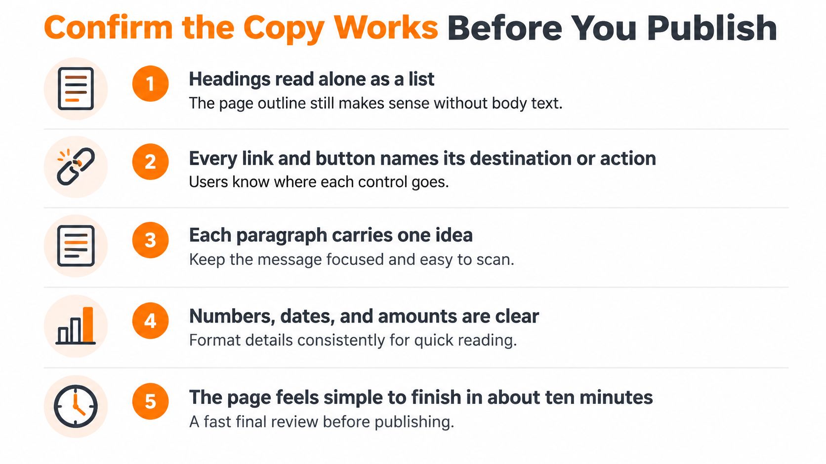
- Outline: Headings make sense as a standalone list.
- Controls: Every link and button names its destination or action.
- Paragraphs: Each carries a single idea.
- Accuracy: Numbers, dates, and conditions match the approved source.
- Recovery: Errors explain what to fix.
- Images and language: Alternatives serve the image's purpose, and the page language is set correctly.
Make the publish decision
Test the finished task with a small group of readers, including someone using a screen reader or text-to-speech. Record hesitation without coaching them toward the answer.
Use the grammar-checker guidance to support a final spelling, grammar, and sentence-clarity pass, with the grammar checker as an editing aid. Users should always review the final output themselves before publishing or submitting it.
Knowing how to write accessible website copy isn't the publish gate. Publish only when these checks pass and test readers find the next step without help; otherwise, revise the step they missed.
Common Questions About Accessible Website Copy
Does accessible copy have to be short?
No. A longer page can be accessible when readers can locate the answer and choose whether to read supporting detail. Don't remove a necessary condition just to shorten it.
Is alt text part of website copy?
Yes, when an image carries meaning or performs an action. Describe its relevant content or function; give purely decorative images an empty alternative so assistive technology can ignore them.
Does a readability score prove accessibility?
No. It can flag dense vocabulary and long sentences, but it can't establish that a reader understands an exception or knows what to do next. Use it alongside accuracy checks and reader testing.
Should each language version be written separately?
For important pages, give each language version its own editorial review rather than treating translation as finished copy. Adapt terminology and instructions for the intended readers; translation and rewriting quality can vary by language.
For unresolved questions, use the same task-first process: identify what the reader needs to do, preserve the necessary information, and check the finished experience.
Lumi Humanizer helps refine AI-drafted text for clearer, more natural voice and flow while aiming to preserve the main point. Visit Lumi Humanizer to work on a draft, then compare the result with your approved source before adding it to your accessible website copy.